The Colour Clinic: The Ceiling
Ditch the white lads, your home will thank you.

I have never painted a ceiling white. Ever. Actually that’s a lie, when I was 11 and my mum and dad bought their first house I helped renovate it in the 6 weeks holidays and I painted the ceiling white then, but back then I didn’t know any better.
I personally have an aversion to white ceilings, and specifically brilliant white. Brilliant white is not brilliant, I don’t know why we call it that, but I it find it very problematic. Because a lot of the base of a so called ‘brilliant’ white is blue, it will cascade down cooler tones, and if you have warmer walls it can make them look slightly muddier and not in a good way. I for one, am not a fan as I find it very sterile, but I think I’ve bashed it enough so let’s move on.
So what colour should you paint your ceiling? Historically, ceilings have largely been pale from the days of ancient Rome, to the rise of neoclassical design which emphasised crisp, clean lines and simplicity. Lime based white washes or mixtures which included pigments such as chalk offered reflective qualities and highlighted architectural details, and I would say to this day a chalky finish on your paintwork is still the best in my humble opinion. A flat finish on ornate plaster works allows those details to shine, and I love it. Don’t get me wrong, I do love a gloss in the right context and I do feel its underutilised, but that’s a story for another day.
So when it comes to painting your ceiling, which way do you go?
White Vs Colour
No two spaces are every the same, and each space needs consideration depending on what’s going on in the room. Paler ceilings do reflect and make the space feel lighter so it’s a usual go to for the majority of spaces. But sometimes, I think a space needs a bit of pazzaz. A bit of razzle dazzle. An extra design detail which can really change not how the space ‘looks’, but how it ‘feels’. So whilst I personally don’t believe there is a golden rule so to speak. but there are considerations and questions you should be asking yourself
White Ceilings
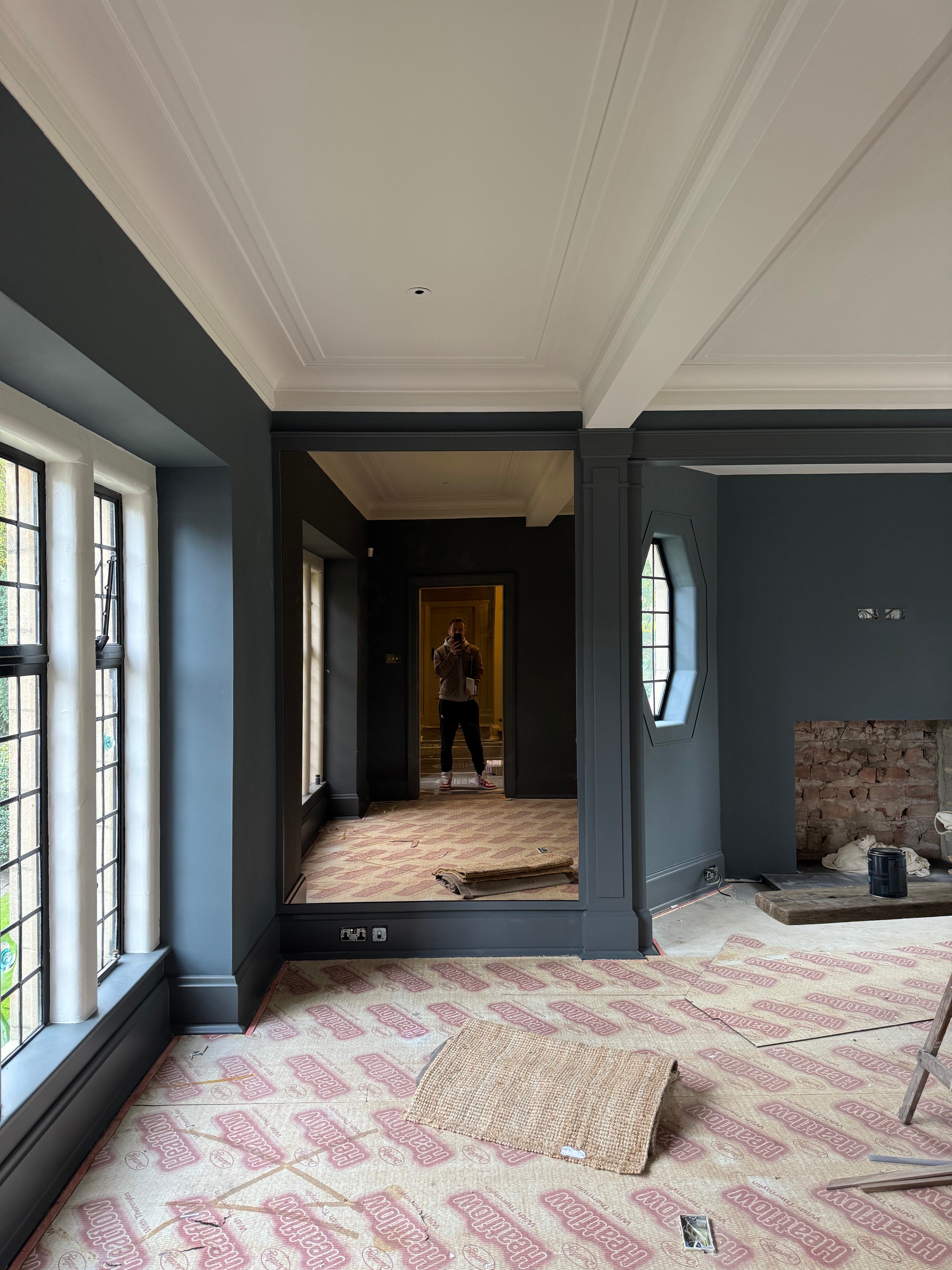
White ceilings ultimately have their place, and in the above image above in one of my residential projects, we went for a strong steeley blue for the walls so it felt only right to go for a lighter shade overhead. Something which felt quite crisp and clean, as the rest of the room will be very paired back to stop it feeling heavy and overwhelming. The shade used here is ‘Modest’ by COAT paints which is the perfect warmer white that doesn’t feel to clinical, and I would say works in any space regardless of which direction it faces. So when choosing a white or paler shades, here are some considerations and tips to help you achieve it
Always go for a warmer white. Always. Our homes should always lean into feeling warm, especially in the UK when we have such shit grey weather all the time, that warmer hue will just counteract that.
To get a warm white, you are going to need a yellower base but this will change in different lighting. Don’t be afraid of leaning into this, I’ve had some people comment before and say ‘it looks like somebody has smoked in there for 20 years’ which is silly that anything other than a sterile white would conjure up such a thing, but I understand the point. You need a ‘hint’ not an actual yellow which will keep it soft and soothing.
If you are looking for a yellow undertone, you are looking for a slight warmth with an almost ‘canvas’ colour that will help that space glow. Taupe can be a lovely soft brown undertone, however in rooms such as east or north facing this can read as grey so be mindful of this. With a pink undertone to your paint, this is a subtle hint of plaster which works well in any space, and can lean into a slightly more playful white.
Testing your colours throughout the day is key, but also testing them in the corner of the room helps so up high where it meets the ceiling, and low down will help reveal how it will react in the space. If throughout the day you notice grey, go back to the drawing board as what can feel warm and inviting during the evening of a West facing space, can look cold in the morning.
If you go a shade or two deeper, this will be quite a contrast to a brilliant white and you may clutch your pearls slightly. Don’t be afraid, a tip I learned from Leanne Kilroy which is absolutely genius - hold it against your skin. Any colour next to a brilliant white is going to look incredibly harsh, but next to your skin tone this softens it and makes it less overwhelming, and I use this tip all the time.
You can use your white ceiling to either ‘elongate’ the room or ‘widen’ it. Painting your wall colour up and over the coving will help lengthen the space and make it feel slightly taller which is best when used in spaces with lower ceilings, or alternatively paint your ceiling and coving for it to appear wider if you have a more narrow space.
My favourite trusted whites
‘Slaked Lime’ by Little Greene - I have used this personally and professionally, this is an all rounder for any space. Not too warm, not to cool, and it elevates everything it touches
‘Naptime’ by COAT - I have just used this in my North facing kitchen, and it works very well and its lovely and soft
‘Leather 1’ by Paint & Paper Library - A very subtle pink/brown undertone which just always looks so effortlessly cool.
‘Modest’ by COAT - A very soft taupe off white, which brings warmth without being yellowy
‘Steam’ by Benjamin Moore - a fresher white with a hint of yellow, but very soft and forgiving.
Use code CCDANLOVATT20 for 20% off your COAT paints order
Coloured Ceilings
I mentioned further up I’ve never actually painted a ceiling white apart from when I was younger, and every space I’ve ever decorated, I’ve gone against the grain slightly. Years ago I painted my ceiling black in my living room, mainly because somebody said it would look stupid so I tried to prove them wrong. Was it the right choice? No. Was I heavily medicated at the time? Yes. So it did look slightly unhinged, but so was I, so you live and you learn.
But when it comes to painting your ceiling a deeper or slightly braver shade, I always encourage it to my clients every time. My reasoning is, its the largest surface area in your room which is completely uninterrupted. No artwork, no clutter, no furniture, just a large expanse that does need a bit more thought. And whilst white ceilings do have their place, I often feel there is such a disconnect between the walls and the ceiling, that going a few shades deeper or something which is a bit more tonal with your walls, just softens the edges a bit.
Let me give you an example, earlier this year I was challenged by COAT to take a guest room from from ‘Cold to Cosy’, and I chose some lovely pinks to warm up the space which was North facing, and used ‘Amateur Ceramics’ on the ceiling.
You can see here, the comparison between this and the brilliant white is very obvious - it’s a lot darker. I shared a preview of this on instagram, and had lots of responses like ‘That’s too dark for that space’ ‘It will make it look drab’ etc etc. But I knew it was the right call for this room as it had great ceiling height, a large window, and I knew the end result in my head, which was this…
Which is not too dark in the slightest. It’s very much a plastery pink and very pale in tone, and I knew that by painting it in that hue it would feel soft and velvety. And when that horrible blue light comes streaming in on a miserable day, this room still has a glow. It’s subtle, but a nice way to introduce colour that isn’t such a start contrast as it’s very complimentary with the wall colour, which is ‘Sybil’.
So if you are wanting to be braver, which I would always encourage, I’m going to give you some examples of things I think are successful, and some do’s & don’ts
Being Brave With Colour
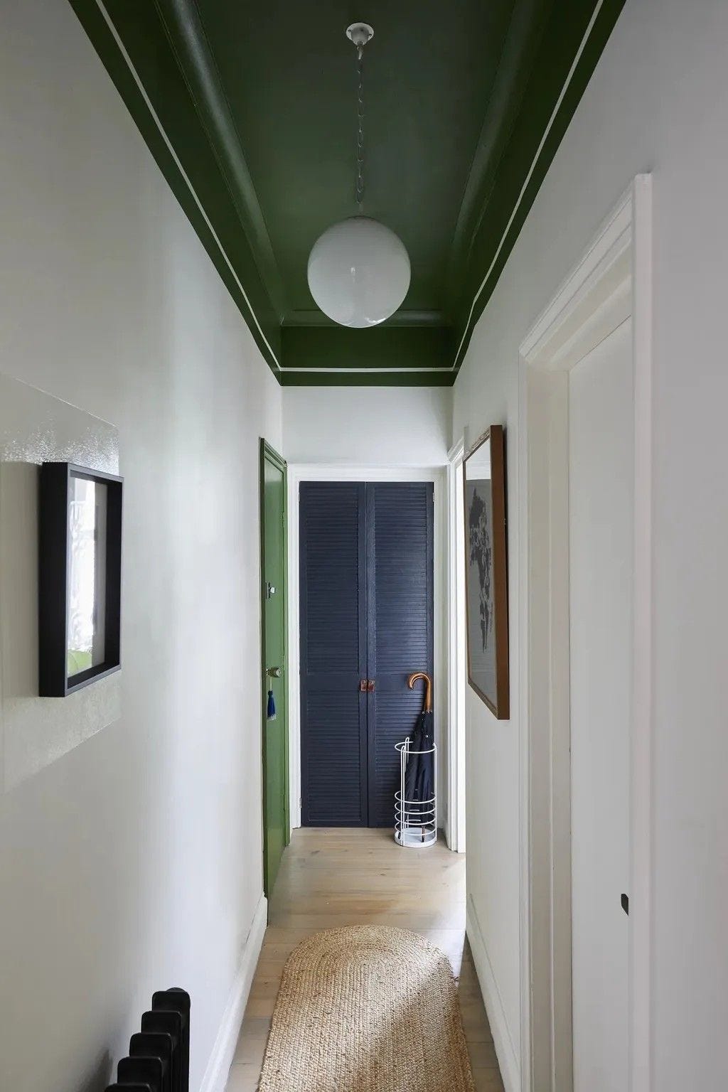
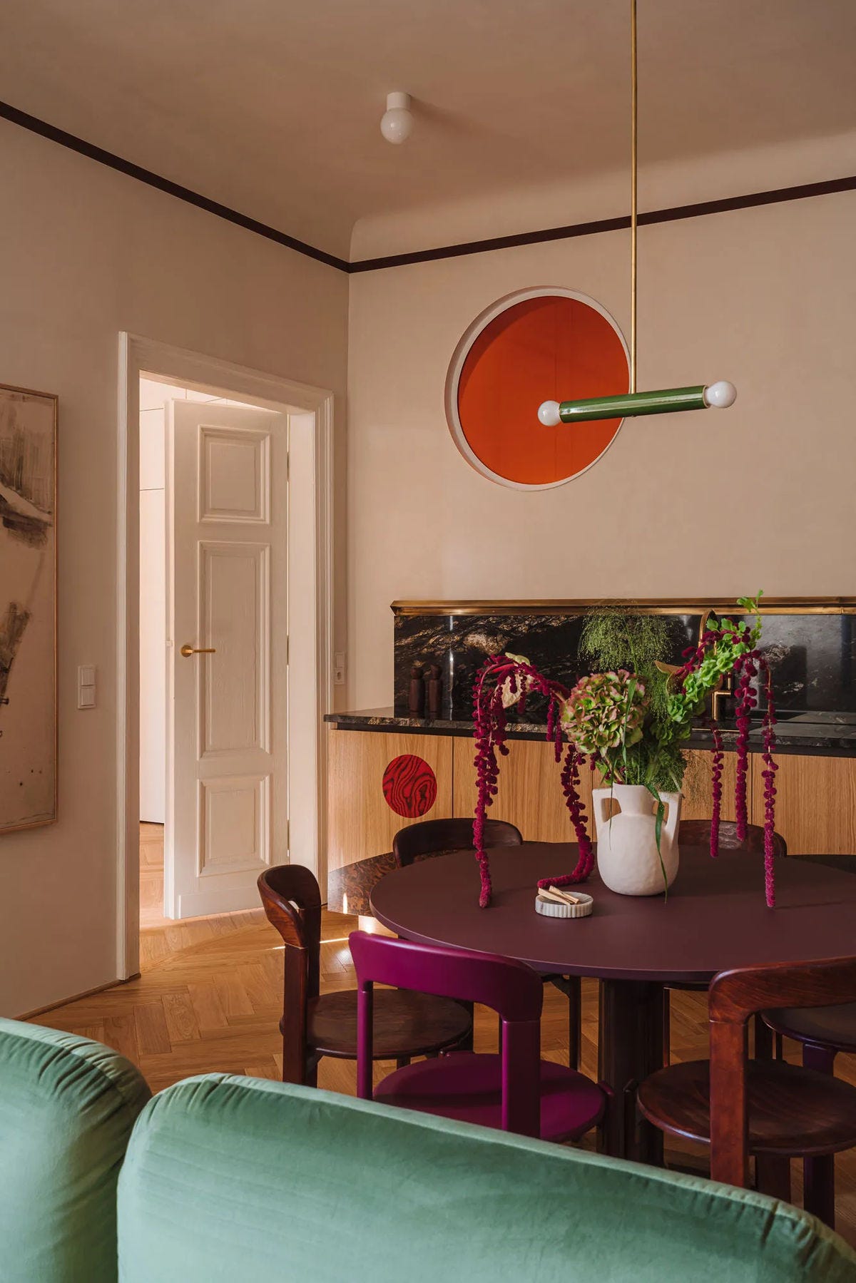
The above image I feel is a perfect example of keeping things simple, but adding impact that doesn’t feel overwhelming. Here Andrew Jonathon of A New Day design used a bold shade overhead which lowers the ceiling in a narrow passageway, and added a clever design detail by adding a single stripe detail. This is a genius idea if you don’t have any architectural details to highlight, but simply paint them in to add interest. By keeping the walls fresh and light, the space doesn’t feel busy even though there is a bold use of colour and another detail to note, he used a gloss square behind the artwork on the walls to highlight it. A very clever example of paint used well.
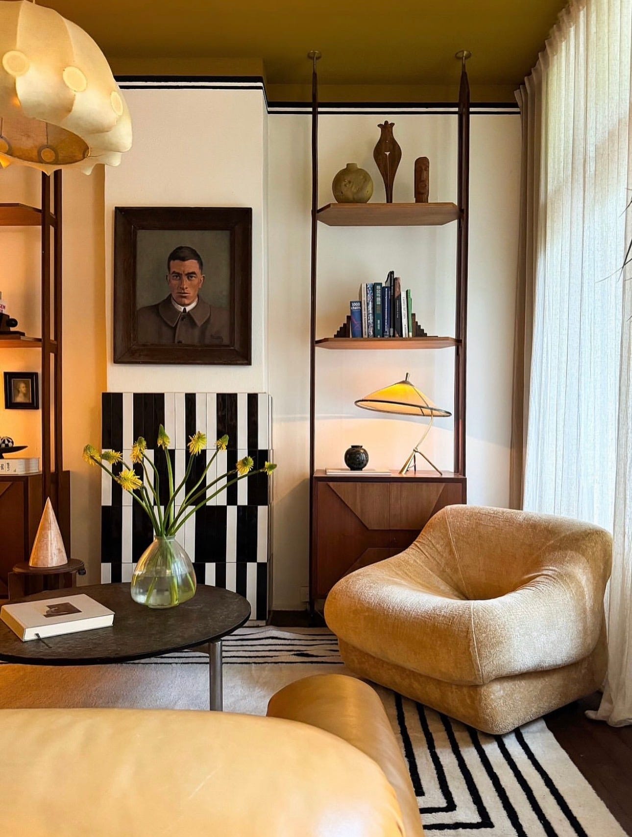
The above image stopped me in my tracks when I saw this, as I think its such a great example of a monochromatic scheme that doesn’t feel flat, but the ceiling detail is genius. Using a beautiful golden hue overhead just makes the space feel cosy and glowing, and the restrained used of materials in the rest of the space works incredibly well. My favourite is the striped detail which wraps around the room, and you can just tell this would be an excellent space to enjoy a whisky in. This to me conjures up a feeling rather than a guide to follow, and I just love everything about it.
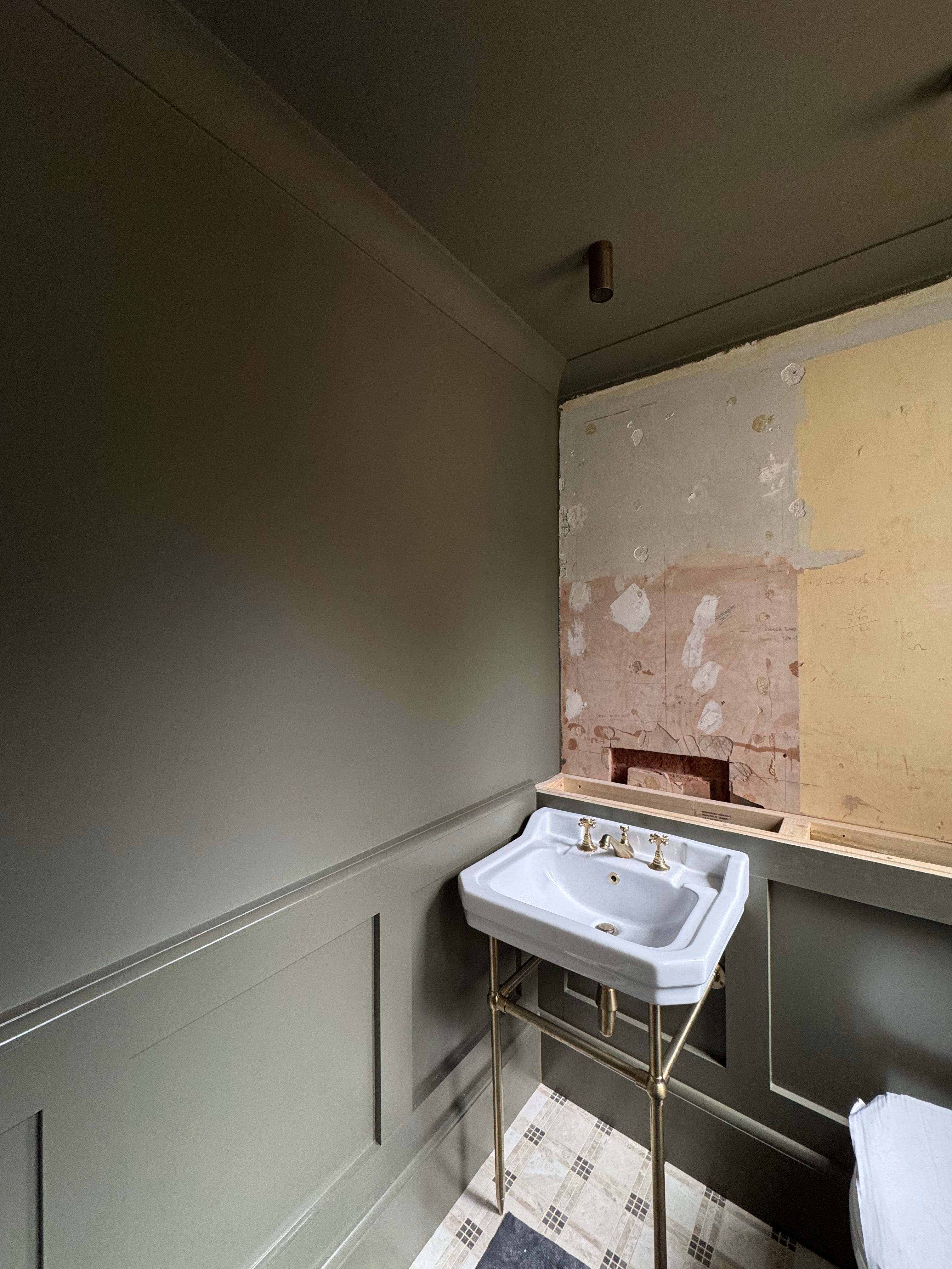
Now colour drenching is always a question that comes up when I do my colour consultancy appointments, and yes people are worried it will date and if it is a good decision, but its nothing new and I doubt its a fad, as I did my first colour drench nearly 15 years ago now and I’m still recommending it in certain spaces. Take the above space for example in one of my projects in a downstairs powder room. This was a complete blank canvas, so we changed up the floor to more of a graphic pattern and drenched the space in a warm green to add a sense of drama. I’m doing a bad thing here of showing you a space which is half finished (I’m waiting on photography) but the point is it still has great natural lighting and it doesn’t feel drab but impactful. I shall report back when this is complete.
So, a few Do’s & Don’ts
Do
Try to be a bit braver. we have always been conditioned to do white, but see your ceiling as another space to have fun with. I’m not suggesting you go wild, but a few shades deeper than what you naturally would is a good place to start.
Consider your rooms orientation and the temperature of the colour - using cooler hues above in East or North facing spaces can make them feel drab, so lean into warmer colours
Do try to select a shade that has some relation to something in the space, either artwork, furnishings or wall colour will make this more palatable.
Think about adding in a design detail such as a simple stripe that sets the boundary of a space and adds definition if you don’t have any architectural details, you could have so much fun with this in a children’s bedroom and be really creative.
Get advise if you are unsure. Painting a ceiling is quite a labour intensive task, and nobody can be arsed doing it twice. I offer Colour Consultancy services which you can book direct through my website.

Don’t
Use brilliant white. Ever. It looks shit.
So thank you very much for reading my thoughts on ceilings, I didn’t know I had so many until I started typing. I would love to hear your thoughts and comments!
Dan x
So many great tips here for me to consider when we move to our new house! Thanks
Brilliant advice Dan. I’m passing this on to Willow as she is in the process of buying her first house, which needs a lot doing to it! But I must say we have never, ever used brilliant white anywhere 😂 Xx